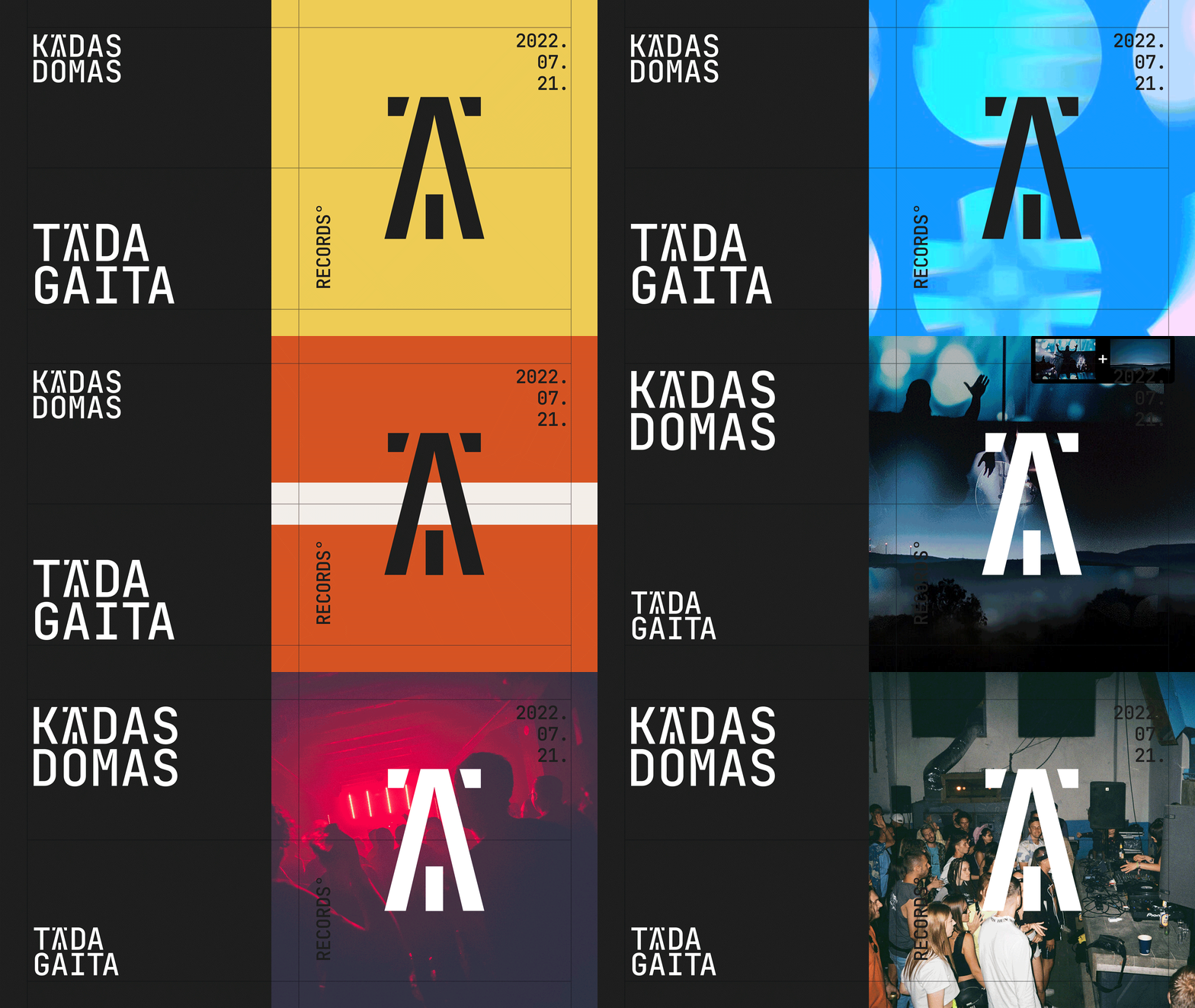
Two independent Latvian music labels are halves of a whole. Kādas Domas specializes in intellectual, mostly non-experimental music, Tāda Gaita, on the other hand, in dance tracks with national charm. Labels are united by one concept and end-to-end graphics. It highlights similarity leaving some room for individuality.
Logos' design of Tāda Gaita and Kādas Domas record companies
2022
Branding

Two labels have the same symbol. There are references to bonfires on national holidays, the cable-stayed bridge over the Daugava and the Riga Radio and TV Tower in its DNA. The locals have to recognize the bear ears of Lachplesis, a folklore character from the Latvian heroic epic.
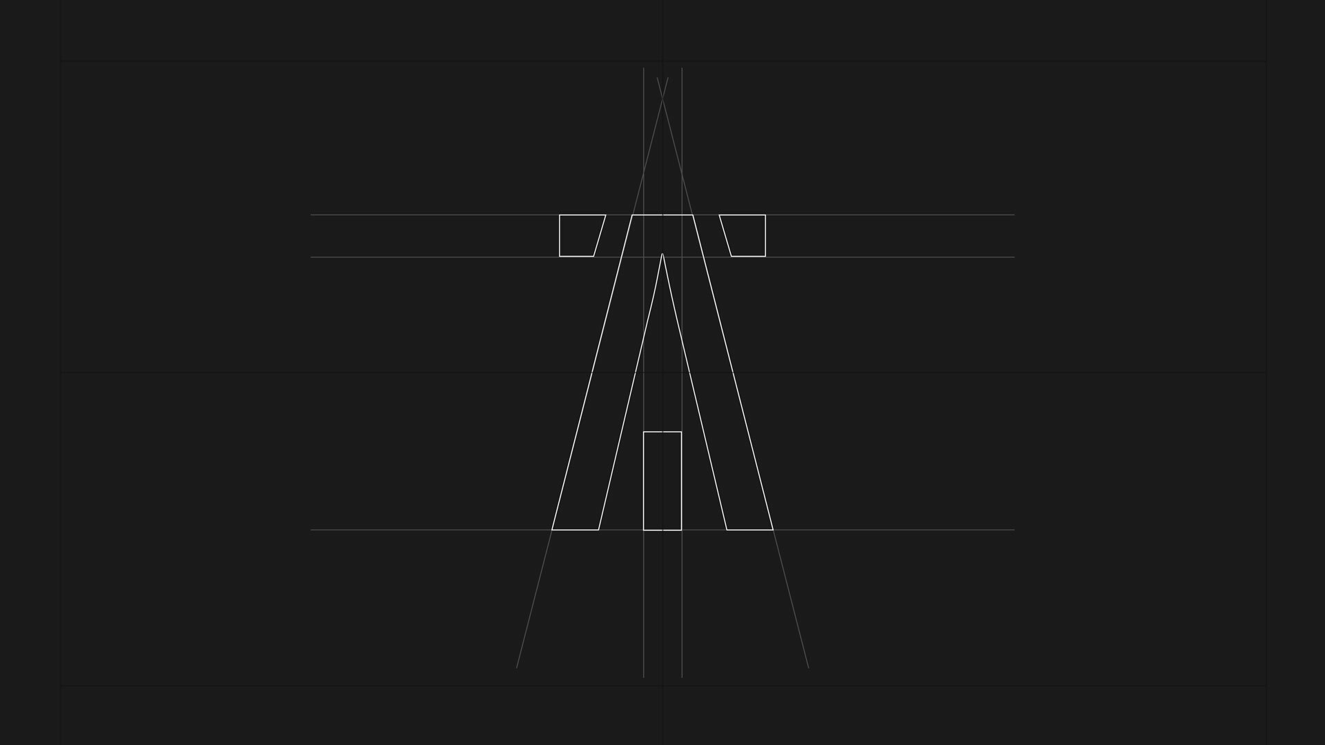
The symbol can be used apart from the text writing or embedded in the logo. A connection between two symbols has been made due to the invariable letter position.
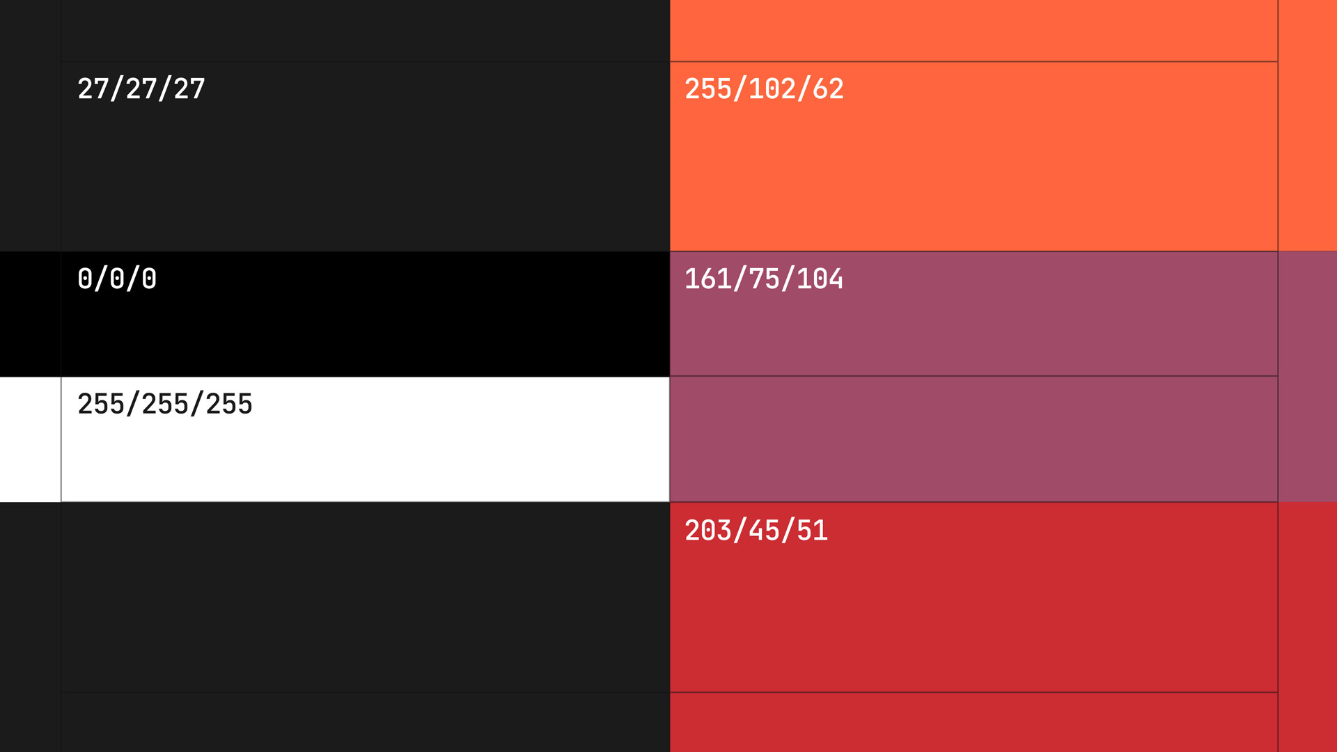
The labels' palette is based on the contrast of white and black colors, focus can be made on a red-orange color scheme.
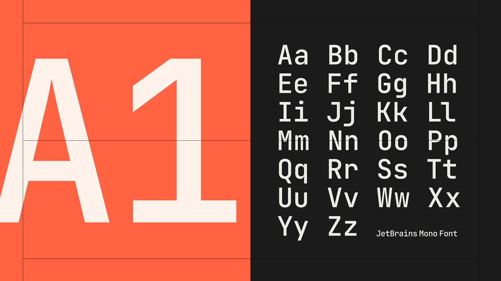
The font is crucial in communication with listeners. We have chosen a monospaced font for posters, billboards and covers. It forms the label’s voice in messages and gives it a clear and biting character like the four-on-the-floor rhythm in the label’s tracks.
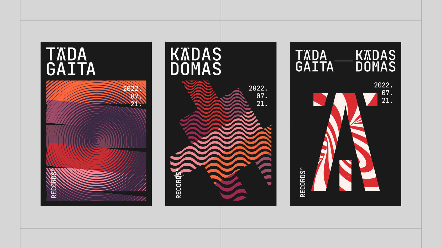
The examples of posters' design.
The examples of records' design.
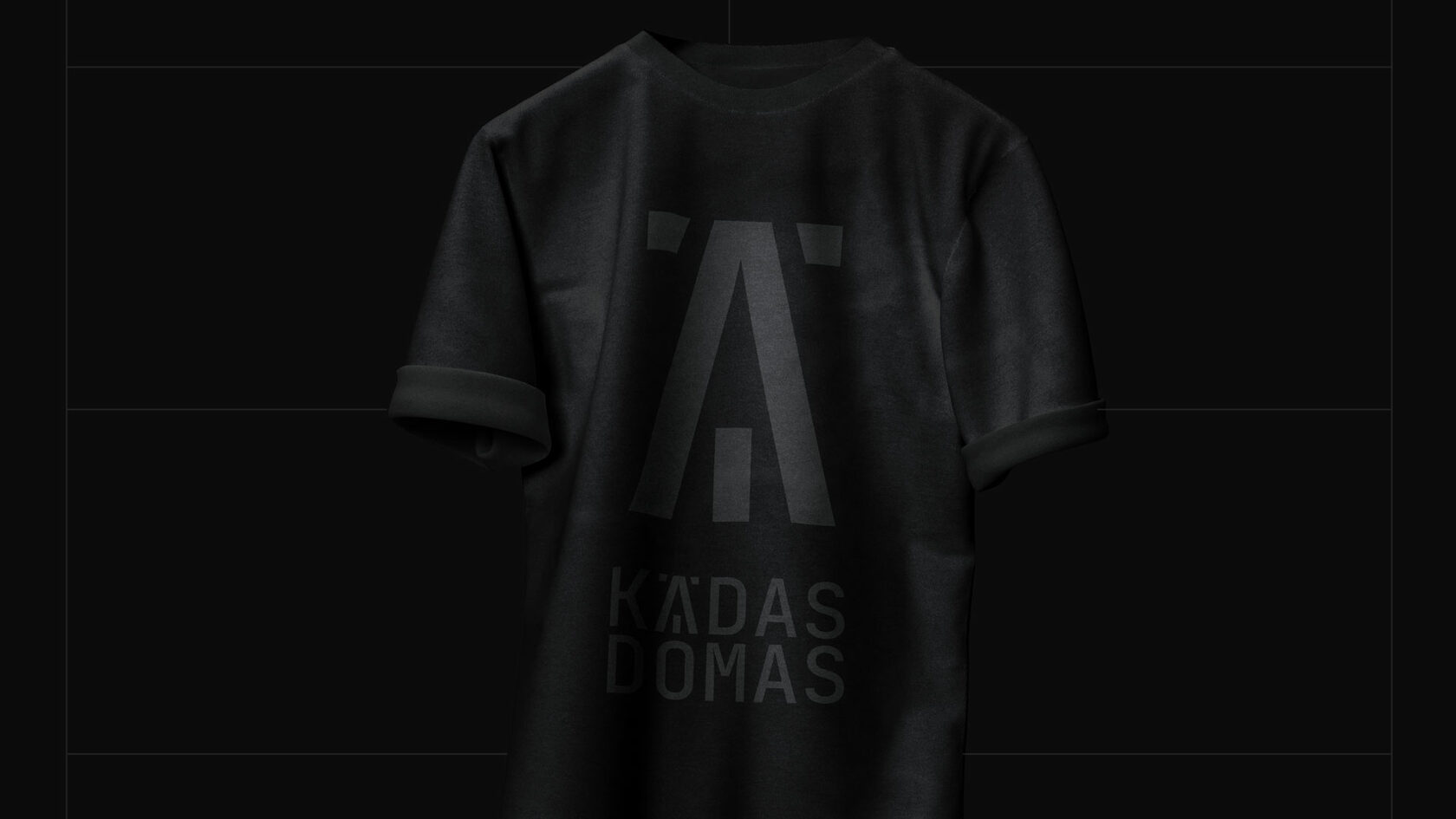
The logo-print T-shirt of one of the labels.
The logos of Tāda Gaita and Kādas Domas labels were designed by:
Designer
Ivan Usanov